Last Updated on May 28, 2020 by Drew Thomas Hendricks
In this article, you will learn all the basics of how to create calls to action that work and finally turn your website into the conversion channel you need!
You have a website for a reason.
There are actions you want your visitors to take in order to continue growing your brand and making money.
Whether you want them to buy your drinks, visit your winery, subscribe to your newsletter, or learn about all the cocktails they can make with your product… there’s something you hope each of your visitors ends up doing while exploring your website.
But how can you convince them to actually do it?
What goes into turning a lead into a conversion?
Well, the short answer is, a lot.
There are several details you need to think about in order to create a high-converting website, including the design, copywriting, navigation, and more.
However, there’s one small component of a page that has a particularly important role in inducing your visitors to act, and those are your call to actions, or CTAs.
Keep reading to learn all the basics on how to create CTAs that perform and generate sales.
What are call to action and why are they important?
As the name suggests, a call to action is a word or expression that calls a user to take a specific action. It’s a small text that tells your visitors exactly where you want them to go and what you want them to do once they’re done consuming a certain piece of content.
You see CTAs all the time when you’re online, not only in websites but in newsletters, blogs, social media, and videos.
All the “Learn more”, “Subscribe”, “Add to cart”, “Schedule your tour”, and “Purchase” you’ve ever seen — those are all CTAs.
There are several types of CTAs and choosing between will depend mostly on the goal you’re trying to achieve. Six of the most commonly used types of CTA are:
- Lead magnets, which are used to gather contact information from your visitors, so that you can build a connection with them and, ultimately, turn them into clients. Often, lead magnets offer an immediate benefit to the user, as in to convince them to share their data. Here’s a great example by Thorn Brewing Co., where they ask you to subscribe to their newsletter but they promise to share all the exclusive news with you and they even let you know about their VIP text club:

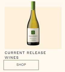
- Purchase, which you use to close a sale, by selling your product or service after your lead nurturing efforts. These are typically found in product pages, but can also be used on the homepage or even blog posts. An example of a purchase CTA is this, found on Halter Ranch’s website:
- Share, which you use to make it easy for visitors to share a piece of your content on their social media profiles. These are usually found at the beginning or end of a blog post and sometimes they don’t even include words – they’re simply the icons of each social media platform, as you see below, on one of 4 Pines Beer articles:
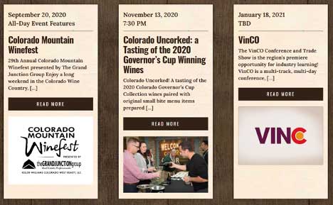
- Learn more, which are used when you introduce a certain topic and you want the visitor to head to a page where they can find detailed information about it. These are extremely common to find in homepages, as it works as a “menu” for all the other pages on the website. Take a look, for example, at this section of Colorado Wine’s homepage:
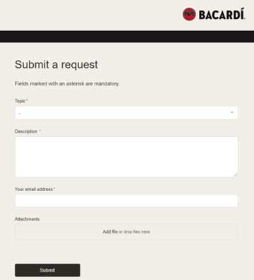
- Forms, which you also use to receive information about the user but that ask them to provide you with a few more details than the lead magnets we mentioned previously. Since filling out a form requires a bit more effort from the user, it’s important that you make it as easy to read and complete as possible. Bacardi does this perfectly with its “Submit request” form. Simple and straight-to-the-point:
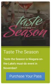
- Event promotion, use to raise awareness about your branded events and, hopefully, get people to register to attend them. If you have a winery, like Wineries of the Niagara Lake, these are the type of CTAs you should be using to get users to visit you for any special occasions:
Now that you know exactly what a CTA is and what some of the main types are, you might be thinking, “Well, creating a good CTA sounds easy enough!”.
Not so fast!
It’s true that this doesn’t have to be a complex task, but the reality is that many businesses are still oblivious to the power of well thought out CTAs. We still open too many websites to find rookie CTA mistakes — mistakes that might seem small but that can have a huge toll on a brand’s conversion rate.
So, the question is: how can you make sure to avoid these mistakes?
Read on to learn nine answers to this question!
9 good practices to remember when creating CTAs
A good CTA is clear, compelling, and easy for the user to find on the page.
Making sure each of your CTAs ticks all these boxes is a matter of taking the time to plan out not only its copywriting but also its design and placement.
Just think about real-life — if a friend wanted you to do them a favor, but they didn’t tell you directly and clearly what they wanted (and, let’s be honest, if they didn’t add an “I owe you one” at the end), how could you guess what they needed you to do?
The same logic applies to you and your visitors and the following nine tips will help you make sure users know exactly which “favor” you need from them.
1. Use straightforward, action-oriented words
When we speak about CTAs, if there is one thing you don’t want to happen is for your visitors to be confused about what you want.
After all, you need to assume that often, when people go on a website, they’re already on the verge about taking an action. Whether it is because they don’t want to spend money, because they don’t have time, or because they’re still not sure that they actually need what you have to offer — most visitors don’t read your CTA and feel 100% convinced about it.
So, to eliminate some doubt the user might have, use the power of words!
- Be clear about what you want. So, if you wanted people to check your Stout beers, instead of saying “Learn more”, you could say “Learn more about our Stouts”. See the difference?
- Use words that induce action. We know this sounds obvious, but the truth is that it doesn’t always happen. How many times have you seen a “Download” or “Click here” button, yet did nothing but keep scrolling? Creating an action-oriented CTA isn’t just about using a verb, but about using your copywriting to make the user want to click.
- Create a sense of urgency. There’s nothing like setting a due date to convince people to do something. Which one seems like it would work best, “Buy 1 bottle & get 1 for free” or “Buy 1 bottle & get 1 for free – Three days only”?
2. Be compelling
We already touched a bit on this topic when we spoke about the type of wording you should use, but there’s more to be said about how you can be compelling with your CTAs.
Yes, you need to tell users what you want, BUT you also need to tell them how they win by clicking.
The benefit might be immediate or not, it might be in the form of a physical product or access to exclusive (or even public) information, it might be whatever is appropriate in each situation – but it is imperative that your CTAs are benefit-oriented.
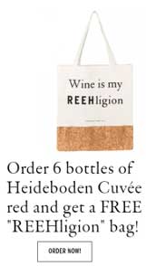
Hannes Reeh does this by letting you know that, if you order six of their Heideboden Cuvée red wines, you get a free tote bad. Red wine is delicious and tote bags are always trendy, so it sounds like a pretty good deal to us!
3. Consider your audience
CTAs shouldn’t be general and we already told you a bit about how you can avoid that by tweaking your CTA copywriting.
Another way of doing so is by customizing your CTAs to your target audience.
And, if you know your typical customers well, this shouldn’t be difficult to do.
Start by asking yourself, “What is the tone of communication that works best with my target?” and then simply apply that to your CTA buttons. This way, you guarantee that you’re speaking to your potential clients in a way that resonates with them, and your chances of converting are higher.
If you have a high-end target audience, you might want to keep things formal, for instance. If, on the other hand, you can afford to go a little bit out of the box, you might do something like the Michael David Winery did, with their CTA to their Freakshow range:

4. Write in the first person
Usually, when writing online content, we’re advised to speak to the reader, using words like “you” and “your”, and the truth is that in certain pieces of content, this is indeed the best approach.
However, that’s not the case for CTAs.
For these buttons, it’s a good idea to switch the “you” to “I” and the “your” to “my”.
Why, you may ask?
Simple: by using the first person, you help the user envision exactly what they’re about to do, in a much more personal way than if you used any other possessives.
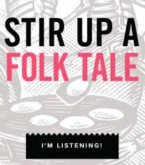
Espolòn Tequila could have used a “Learn more” button here, but doesn’t the first person make the CTA a lot more compelling?
This might seem like a trivial detail, but it can be the thing that makes or breaks your conversion rate. The proof is the A/B test that Beem Digital conducted, which showed a 90% increase in CTR once they changed the “you” in their CTA to “my”.
5. Don’t make false promises
This is marketing 101.
Your CTAs need to make the user want to click, but never through the use of false promises.
If you choose to go that route, you’ll be overselling and under-delivering, which is never a good combination. Sooner or later, your visitors will catch up with your dishonesty and your brand image will forever be damaged in their eyes.
6. Use contrasting colors
We’ve spoken about the copy of your CTAs, but the design is just as important.
The main goal is for your CTA to stand out.
After all, if your visitors can’t find the button you want them to click on, it doesn’t matter how compelling your copywriting and how great your offer is.
So, how do you make sure your CTA doesn’t blend in with the rest of the page?
Through the power of contrast!
Take a look at your brand’s color palette and try to find the color that stands out the most when compared to your website’s background color.
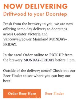
And speaking about color, it’s also important to know when to use “ghost buttons”, that is, buttons with an outline but no color inside.
These are quite useful when you want to give the visitor two possible actions to take, but still want to make it clear which one is the priority.
When you go on Driftwood’s website, a popup appears with two CTAs, but you know exactly which one they would prefer you to click on, right?
7. Place your CTAs strategically
Another factor that plays a huge role in how quickly (or not) your visitors can find your CTA is where on the page you choose to put it.
You need to choose a location that is easy for the user to spot and that grabs their attention at the right time, when they are convinced about why they should take the action you want them to take.
Now, you might be thinking that your best option is to place the CTA above the fold.
And in many cases, it is.
But not always!
There are many other locations where you can – and should – put your CTAs, depending on what you’re asking for, what you’re offering, and what type of CTA it is.
If you’re introducing a completely new product, having a CTA at the end of a blog post about it is a good idea.
If you want people to subscribe to your newsletter, you can use both a pop-up message and a CTA on the footer.
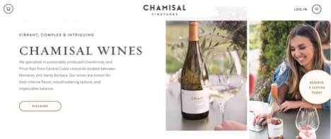
If you want people to visit your winery, as Chamisal Vineyards does, you can place your CTA on the side of the page, so that the user doesn’t forget. The options are endless!
8. Use A/B testing
Using resources like this to understand what the best practices of CTA creation are is a great way of improving your website.
However, there’s nothing like actually testing your decisions to see exactly how effective they are and that’s what A/B tests allow you to do.
Nowadays, many digital marketing tools offer A/B testing as one of their main features so even if you’ve never heard about this type of test, you won’t have a hard time understanding how they work.
Remember to keep testing your copywriting, your color choices, the placement, and even the size of your CTAs, and you’ll gain more and more insights about what your audience best responds to.
It’s a foolproof way to continuously improve your strategy!
9. Offer additional information
There will always be skeptics and trust us, a simple button won’t be enough to convince them to click.
That’s why providing some additional information alongside the button can be useful. Instead of just asking users to do something, you take the opportunity to share something that proves why everybody wins with their click.
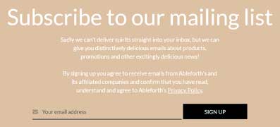
Ableforth’s CTA could say something as “Subscribe to our newsletter”, but they go one step further and tell you what you’ll get access to if you do. It might just be the last push someone needs to sign up, and they know it.
Are there any restrictions when it comes to CTAs for alcoholic beverages?
So far, we’ve shared tips that work for any industry.
But if you sell wine online, or any other alcoholic drink, you know that advertising your products isn’t all that simple. Given the nature of your products, there are certain rules that you need to follow when promoting them.
So, what do you need to remember when creating your CTAs?
- Don’t make any false or misleading statements.
- Don’t state false health benefits of consuming alcohol.
- Don’t use irresponsible drinking promotions to appeal to the consumer.
- Don’t target teenagers.
- Don’t encourage excessive drinking.
- Confirm the age of the visitor before selling any product.
Follow these rules and use your common sense, keeping in mind the two words that any alcohol manufacturer knows well: drink responsibly.
Start converting with your new and improved CTAs
You know what a CTA is, you know nine essential tips on how to create an effective CTA and you know which specific rules apply to alcohol brands.
Now, there’s only one thing left to do and that’s using all of these insights to boost your website’s CTR. Good luck!
